
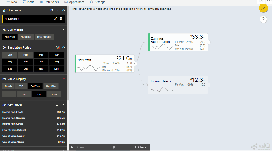
A Node act as the fundamental building block in ValQ. It becomes vital for the user to understand the richness of data each node provides as he plans for
the big picture.
Let’s dive deep to understand what these projections demonstrate;
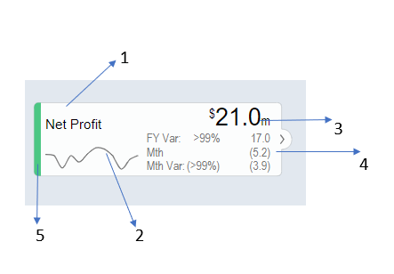
1. The name of the Key performance indicator: The title of the key performance indicator is displayed on the top left corner of the node
2. A sparkline: A line chart projection of the actuals and forecast figures are displayed below the name of the KPI on the left bottom corner of the node
3. KPI Value: This figure implies how the indicator is performing for the default fiscal year on the top right corner of the node
4. Three data points beneath the KPI Value: The first figure projects the fiscal year variance of the forecast compared to the budget for the default fiscal year both in percentage and in absolute terms
Beneath that it shows the absolute value of the forecast for the current month and how it makes headway with respect to the budget. It is displayed in both percentage and absolute terms. The month usually corresponds to the first period in the simulation period series.
ValQ, also helps the user to view the data in a different set of periods. Say the user wish to view the data for a month alone, he/she just need to select the month button in the value display panel. When the user changes the view to a month in the value display correspondingly the figures at the bottom also changes to the full fiscal year.


Similarly, the year till date (YTD) option displays the primary value compared to the performance for the default fiscal year. When the user changes the view to YTD in the value display correspondingly the figures at the data points beneath KPI Value also changes to YTD values as shown in Image 3. Clicking on the simulation months helps the user to view how we are expected to perform in the following months.
ValQ, also allows the user to view the data in different scales like in thousands, millions, or in billions. This can be done by just clicking on the required scaling on the value display panel. The visualization tab also allows the user to change the amount of information shown in each node by simply clicking on the full, standard and minimal buttons.
5.Conditional formatting: The vertical color bar on the left side of the node indicates the performance of the KPI which changes from green (if good) to amber(neutral) and red(poor). ValQ also has the capability to manually configure the threshold values.
To learn more, tune into one of our ValQ Webinars or try our product for free here.


